Candidate #4
Posted by Ellery
6 March 2014
Please login for comment.
-
hatake:
For the first candidate you were talking about how the body wasn't right and the colors weren't, however that's a similar problem Ellery had. I remember when they first joined, for a long time (s)he made the heads too big compared to the rest of the body, and a lot of people talked crap, wanting Robert back. But I'm sure if this new guy worked here long enough his stuff would look better.
That being said, my vote is still with Candidate 2
010 Mar 2014 16:51
-
:
Well I'll still be rooting for #3 due to the fact he can draw the bodies and faces right (anatomically correct) and given that fact I can at least expect him to improve much faster than the others since getting the color palette right and adding normal line art in his works aren't something needing a great amount of time to improve considering he has already shown to be capable of coloring and shading quite well. However, with no disrespect, I'll have to disagree with you on #1 being close to El...
show more
lery. I find that a bit disrespectful towards Ellery though. She was far superior to #1 and he didn't even drew the bodies and faces right compared to Ellery. I'm sorry but #1 is far out of Ellery's league. And considering the coloring, Ellery always knew how to make the colors blend well with each other to create some kind of natural flow to them but when I look at #1 the colors are too individualized, they don't seem to blend with each other, making the whole pic seem like just line art colored with pretty colors and not so much as a real work of art. #3 is the closest in my opinion to Ellery, he only needs to be given a chance to do some normal line art works and improve a bit on the faces to resemble even more the characters chosen to be drawn while getting used to the color palette because in terms of colors he missed a little on Orihime's hair. The colors used are ok mostly, the skin is nice but regarding her hair he went a bit towards to much dark red there. A lighter orange would easily fix that problem. So I say #3 deserves t he chance to work here.010 Mar 2014 12:31
-
Bob:
hmm we should do a orihime assview whos with me
09 Mar 2014 03:00
-
TakaSasuke20:
I change my mind. #1 and #2 are better.
08 Mar 2014 07:32
-
hatake:
You do realize going through a big process like having 20 candidates and doing multiple rounds will take a ridiculously long time. Granted we have waited long. That process is way too long though, and from what i've seen hentai artists typically don't like working for free, so i doubt they're willing to go through a long process to get the spot.
I say we should just get 5 decent pictures to decide from, and a voting system that's more fair unlike the current one. The top rated ones move on. L...
show more
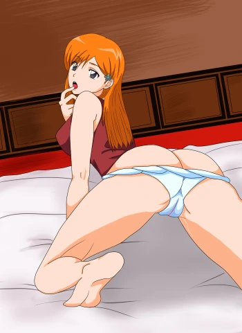
ike I said, 5 decent pictures. I don't like disrespecting artists, I know their work is important to them, but pictures like this one and also #3 don't cut it for this site in my opinion. I find #1 the closest to Ellery's style, although the picture felt pretty bland and generic and the heads for both characters weren't very good, although I'm sure if they drew the characters more they'd get better. As for #2's picture, I really liked that one. Sure it's not as detailed or colored as the others, but the positions, expressions, and the way they looked looked more appealing to me than any of the others. As for #3, I'm not saying the person is a bad artist, but I am saying that for a legit hentai site that is based around an anime series that the pictures should have the same drawn/digital style. Not paint. Not to mention it was very blurry, and I'm not just talking about the background; the lines and characters were very blurry. As for this picture, I can't say much without insulting the person who drew it. It's alright, but too softcore and not that good of a style. Number 2 has my vote, but that's just my opinion08 Mar 2014 07:12
-
AzulaX:
As long as we are getting MORE CANDIDATES, I will not hate. If you can tell us why its taking so long to just post all the candidates. Does HentaiKey think that they are as complex as "America's Top Model" or "The Voice"? Post all the candidates in ONE POST - and I mean even the ones that you guys probably denied before posting their works at all - and put up a poll were people vote.
Like lets say there are 20 candidates for example. The top 15 candidates will go for another round posting an...
show more
other submission and then we viewers vote again. Then the top 10 will go for another round. And then top 5, and then top 3, and then we have our winner. Bottom line, you are gonna need allot of candidates in order for us to be satisfied. Having only 3-4 mediocre candidates won't cut it. At the bottom banner of this Pixxx-site it states "HIGH QUALITY ART". I'm willing to pay for a downgrade, but not for a COMPLETE downgrade. If you understand my gist.07 Mar 2014 19:58
-
TakaSasuke20:
This one has my vote like #1 and #2 do.
07 Mar 2014 16:59
-
:
I like this candidate
07 Mar 2014 13:54
-
HEF:
I like how you did the face and skin color but the leg is regular
07 Mar 2014 13:53
-
Saori:
How do you apply?
07 Mar 2014 03:47
-
shinigami:
Ì think with a change of hairstyle it could easily pass as Yuzu
07 Mar 2014 01:03
-
shinigami:
I still like #2, but this one makes better use of colour and tone, despite the fact that it looks nothing like Orihime.
07 Mar 2014 01:00
-
Xeos:
It may be softcore, but it's like a tease pic at the same time, dat ass though.
Anyway, the face would need work, and the food looks terrible.
07 Mar 2014 00:01
-
:
I really don't like any of these. Like not to be mean to the artist, they're fine. But dropping from Elley to these guys is quite the drop in quality, no that they are bad, Elley was just really good.
06 Mar 2014 23:33
-
Just a Guy:
Probably the best prorpotionally. Probably the best body wise. Needs some work on face, hair, and hands and feet. We still don't know he/she draws girls having sex though.
06 Mar 2014 22:06
-
hatake:
Not saying that it's bad, but I will say it's not very acceptable quality.
06 Mar 2014 21:50
-
WakeUpKiva:
This drawing style reminds me of the person who used to draw Bleach HentaiKey.
06 Mar 2014 21:30
-
Isshin:
this one is pretty bad. I really hope bleachpixxx does not hire this guy
06 Mar 2014 21:29
-
...I_LOVE_IT...:
just opinion i like candidate #2
06 Mar 2014 20:06
-
:
This isn't that great either. Pretty much has the same flaws as Candidate 1's sample + the bland coloring and even less resemblance to the character itself. Currently Candidate 3 is still the most promising. Hopefully he gets hired soon. Also thanks for adding that extra note regarding the down-voting. Maybe now haters will stop raging with the down-votes.
06 Mar 2014 18:24
-
admin:
<strong>I'm not totally sure how many candidates there are, so I'll keep posting as many as I receive.
this one is kinda "softcore" as one might say, so lets just focus on the style the artist is using.
Please leave your reviews, criticism, ideas and suggestions in the comments, we need it to improve the artists, no need to hate/downvote every comments :)
best regards,
-WebAdmin</strong>
06 Mar 2014 18:17


