Showdown: Candidate #3
Posted by Ellery
13 March 2014
Please login for comment.
-
:
As some already said, the faces look strange and doesn't resemble to the characters at all but the rest is fine.
For me candidate 5 still wins for now and i would really love a second picture from him.
About candidate 1, i really liked his first attempt but... his second attempt sucks.
So my favorites are canditade 5, 6 and maybe 3. (I would really love to see another one from 5th to be sure he's good).
015 Mar 2014 02:09
-
...:
neh these wont do maybe 5 or 6
014 Mar 2014 15:20
-
SweetBlow:
Candidate #3 will be hard to beat !!!
C3 and C5 look the most promising, but it's hard to tell which one will show the best improvement!
@hentai-key: Maybe you should pick the two or three best voted candidates und give them another test phase, let's say half a year. Because it'll be hard to draw good qualaty pics daily for only new artist. There should be at least 2 guys running bleachpixx(, so same with Narutopixx) for the next months.
Greetz
014 Mar 2014 13:38
-
Ricky:
This one has my vote. I'm not sure if everyone gets a vote or if it's only the subscribers, but if we all get a vote, this is where I'm casting mine.
014 Mar 2014 13:21
-
shinigami:
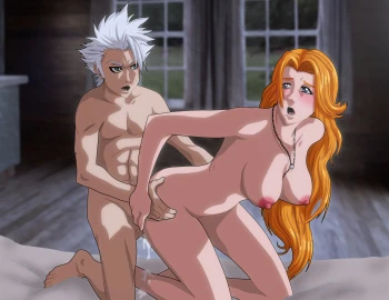
This one is the better of the two currently uploaded by far. The faces of both characters are clear and expressive without detracting from the rest of the image as in the first submission.
014 Mar 2014 08:52
-
lesbian rukia:
To tell u my honest opinion if you. Wish for People to return to thi site you have to consider canidates #5 #6, they are the closest arts to ellery. #6 if they can only fix body proportins and placment (which will be fixed in time and practice) will become a second ellery, and #5 overall is not bad atleast better than #1 and #3. Again only my opinion but it is the truth thank you.
014 Mar 2014 08:48
-
uxn:
That Good!!!
014 Mar 2014 05:43
-
DarkerLover:
Candidate #3 was good for his first picture, but now it is a meh
014 Mar 2014 03:11
-
Rezo:
The two recent photos don't hold any resemblance to the characters in terms of facial expressions or even the Face in general.
NarutopiXXX and BleachpiXXX were always about a strong anime art-like resemblance.
014 Mar 2014 01:37
-
hatake:
I will say this one is somewhat better than the first picture we got from them, and loads better than the second picture for Candidate 1.
And as I said in the other pictures area, I don't like insulting an artists work, I like to have respect for artists. I think the colors are better, and it doesn't look painted like the other one, the art style looking better. However I think their faces are pretty bad, especially Hitsugaya's.
As I said in the other place, I'd rather see a second attempt...
show more
from candidates 5 and 6, maybe even 2. The second attempt for the first guy I found god awful.014 Mar 2014 00:33
-
PETER:
Candidate number 3 all the way baby!! I actually think this one is even better than the first one he did.
014 Mar 2014 00:15
-
AzulaX:
Seeing as this artist follows suggestions & critics very attentively, I'd have to say that this Candidate seems to be the most promising. Seeing as the previous attempt was an actual painting, to this vectorized look. Candidate 3 has already proven that he can adapt his styles to whatever suits the situation. What this means is this: He is will to take suggestions and improve.
The black lines encircle the characters feels out of place. If the outer-black-lines had less opacity (more tran...
show more
sparency) as well as colors that matches what it's enclosing (hair, skin, nips) it would appear more natural. Because it almost felt as if the black lines were unneeded. Rangiku's left eye does look kinda weird too. All in all, Bleach-PiXXX would be in good hands if this candidate were to be the new official artist.013 Mar 2014 22:47
-
Xeos:
Eh, it's good, but I don't like the art style one bit at all.
I'm hoping that Candidate 5 is also part of the showdown right? That's the best candidate in my eyes.
013 Mar 2014 22:37
-
coco:
Don't lose this guy! It's clear that this guy can be very good. My only down point is her arm a bit longer .He just needs a bit time and he will nail it!
Time and Effort 7/10
Quality 5/10
Colour 7/10
Proportion 7/10
Detail 9/10
is it Bleach? 7/10
ENJOYMENT 6/10
score 7/10
013 Mar 2014 20:19
-
Sasuke -fms-:
This second pic from candidate 3 looks really good
Some people said his first work were more like a paiting but seeing this one in full resolution, in my opinion is looking more like the anime, This one has a great potential
013 Mar 2014 20:17
-
TakaSasuke20:
Hmm #3 Looks a lot better than his/her previous entry. This one doesn't look like it was painted this time.
I vote for #3.
013 Mar 2014 19:18
-
scrido:
all great but faces... noses are so baad... anyway its better than candidate #1
013 Mar 2014 18:58
-
scrido:
alll great but dat faces... noses are so baaad anyway its better than candidate #1
013 Mar 2014 18:57
-
Bob:
Not a fan of this and the faces look quite weird to me. Let's get more from Candidate 5 who is undoubtedly the best so far.
013 Mar 2014 18:53
