Candidate #6
Posted by Ellery
10 March 2014
Please login for comment.
-
Derp:
This guy. Better try than all the others. Still far from ellery though.
013 Mar 2014 19:23
-
:
No
013 Mar 2014 15:16
-
Kyuubi:
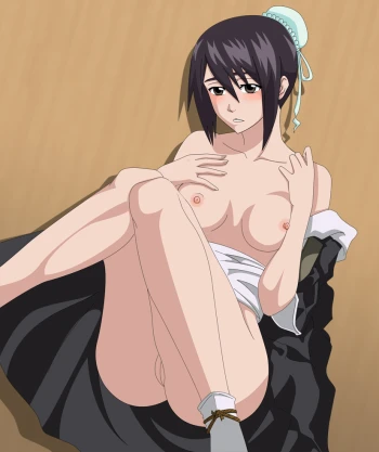
This is actually probably the closest pic to Ellery's style. There are flaws, most noticeably the fact that her head looks like it burst from her shoulders, however, it is possible the addition of the pillow mucked up the artist, if he didn't put one he would have had to draw at least some of her neck making the picture look less... disfigured.
That being said the rest is drawn well, even if the legs look three times the size of Orihime's arms, but that is probably because of the perspective th...
show more
e artist was trying to portray. The nipples are also a tad irregular (they look like jols to me) but the overall quality of the picture outweighs the flaws and with a little bit of practise the artists work could soon reach the quality of Ellery's and possibly surpass it given a lot of time.013 Mar 2014 02:16
-
:
I gotta say that's actually a great idea. Have the candidates draw one of the girls with a more complex appearance like Matsumoto, Orihime or, even better, Shutara (since she has the moon ornament and all ) having sex in a more daring position. If they all stick to the same theme there will be a better basis for comparison.
012 Mar 2014 17:11
-
Kida:
Well he is very good at drawing faces, and pussy, and separate body parts. But it knda looks a little bit twisted when it comes to anatomy. It looks like her face comes from her boobs and its in between her shoulders...
But the only good way to really know who is the best artist is to make them all draw the same thing. A different character or position can make people think the artist is better or worse, depending on wheter they like the character or not.
011 Mar 2014 04:17
-
S.Aizen:
The positions a little strange, but overall it's still a pretty good picture.
011 Mar 2014 01:43
-
TakaSasuke20:
Did you forget that it can be female and female too?
010 Mar 2014 20:35
-
Raven:
I really like this picture. The coloring and shadowing are good. But I feel a little uncomfortable with the body proportions. The head seems a little bit displaced to me. Other than that he has drawn a good and detailed pussy for a beginner which I afraid other candidates have failed to provide. #5 and #6 are best choices imo now. I also like #3. If he can provide pictures without painting then my vote is definitely with him.
010 Mar 2014 19:17
-
AzulaX:
I forgot to mention that the Gaussian-blur and the "fresh glow" that Ellery mainly applies to her art is not seen in this image which makes the flaws in the coloring very visible.
And I feel as though the coloring of breast and maybe even the way its drawn should have been better. The detail for the vagina is impressive though.
010 Mar 2014 18:57
-
Shussy:
Both the candidates look good, but I wanna see how they draw males too. They can draw a girl, but who knows how they're gonna draw the guys. Candidate number 1 was the only one with a bleach guy present, and that obviously affected his score because he made Mayuri look weird. It is supposed to be hentai, which is male and female, so why are the males excluded? Id like to see how they draw the males as well.
010 Mar 2014 17:48
-
AzulaX:
At first glance (especially when viewing the thumbnail) you'd see some familiarity that resembles Ellery's art. The way the head is drawn, as well as the eyes and mouth, you can tell that this artist used the same facial templates as Ellery when creating the face. The coloring & shading is also okay, but that fresh glow that Ellery always applies to her art.
The things weird about this pic is the way the nipples are drawn (it's just soooo out of place). The coloring of the nips helps, bu...
show more
t it's just too polygonal. The body proportions could use some work, and the body positioning should have been done better. And the head seems a bit too big. It's great, but I need to see this artist post another image with less clothes and a "fulfilling position" before I can feel confident enough to give it the "okay".010 Mar 2014 16:40
-
:
Oh God Orihime what happened to you? Um anyway great coloring and lighting effects going on there, her face is resembling Orihime but the body looks too twisted and not so well drawn in terms of proportion. Pussy looks ok though. Still #3 the best choice in my opinion.
010 Mar 2014 15:51


