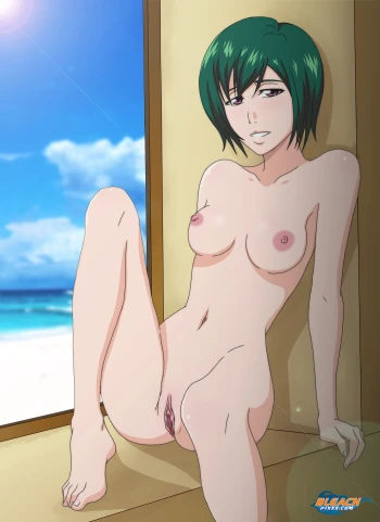
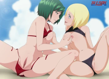
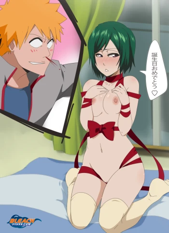
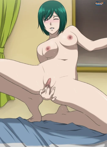
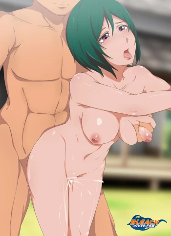
BLEACHBEACH 2015: Nozomi's Summer
Posted by Joe
Tags: Nozomi Kujō, Bleach Beach,
20 June 2015
Please login for comment.
-
KRMeiterumilover23:
Good
010 Aug 2015 01:25
-
hemisphere:
Well im not an artist so i cant tell you exactly what to do to improve, but this picture just doesnt feel "right" and im sure you can tell too.
024 Jun 2015 00:50
-
joe:
Mmmkaay. Good for you. It's your opinion. Though it would be helpful too if you can give an idea of how it can be improved but that's alright.
023 Jun 2015 20:50
-
hemisphere:
nah theres definitly something wrong with the body porpotion especially the lower half of her body and her face i feel is not very well drawn, she looks kinda old like in the 40s or 50s.
022 Jun 2015 05:26
-
joe:
Hmmm. You could try refreshing the browser maybe then redownloading? Let me know if it still has the glitch.
022 Jun 2015 04:47
-
joe:
Err, I could be mistaken here but aren't Kubo's females supposed to be "too skinny"? I think it's part of his art style and that's actually what I was going for.
022 Jun 2015 04:46
-
joe:
Yeah, sure. For now, there are four softwares I use (and try to master) - Sai, PSCS6 and Manga Studio 5 then Procreate on the iPad whenever I feel like working mobile while I'm out and about (only sketching and inking). I have a Wacom Bamboo Capture for the desktop and a Wacom Creative Stylus for the iPad. Hopefully by next year I can get enough funding for at least a 13-incher Cintiq or something comparable like a Surface Pro - depends.
022 Jun 2015 04:38
-
PinkHair:
Please let us know what new low-key softwares you'll be using...
I know that Darwin (narutopixx artist) uses something similar to FireAlpaca (free).
021 Jun 2015 11:58
-
hemisphere:
shes way too skinny in this picture and her face looks like an old hag...
020 Jun 2015 20:22
-
Coltsguy:
There seems to be, when I'm looking at it on my computer, an upload glitch just above her chest where everything is misaligned. Is that just me or does anyone else notice it?
020 Jun 2015 05:52
-
joe:
I think her cup size is somewhere near Rukia's so it's really in the small side, I think.
As with the softwares, I always like to experiment from time to time as I tend to get bored when I get too comfortable with a software (or a style). Besides, the look I wanted to copy is the actual inking style from the anime - the not too fine/perfect lines that makes it obvious that the lines were inked traditionally. In animation, what I observed was lines were done traditionally. Sai's lines are too ni...
show more
ce and clean hence the 'traditionally inked' looked is hard to simulate. And lines tend to get too wobbly when on a very low stabilization setting (as I'm only using a lowly Wacom Bamboo - if I were using say a Cintiq, then it will be a different story). Doing lines on an ipad (or a Cintiq) eliminates the need for a stabilization setting and let's me get that pen on paper feel and more control on the strokes. So for me, switching between the three softwares won't make the process slower. As a matter of fact, without the 'pen on paper' feel when inking, the process actually slows down since I have to undo then re-stroke the lines. So in short, I think this new thing I'm trying will potentially be easier and faster for me in the long run.020 Jun 2015 03:00
-
Celto:
Her breasts are a little on the small side, but that's okay.
I think using 3 different types of digital artistry software is a long process. I mean doing several stages in a different one may cater to making it easier for you, but it sounds like a long and tedious process that could result in less pinups.
Or do you find it easier?
020 Jun 2015 02:32
